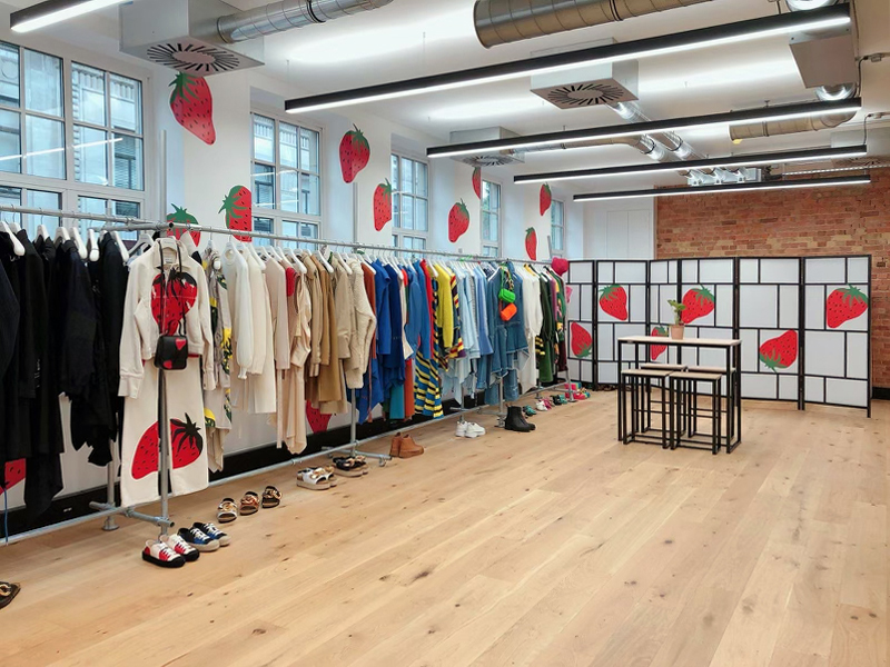
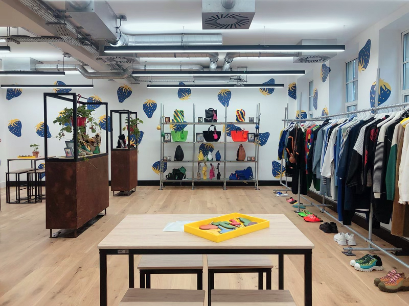
Who likes strawberries? Perhaps blue ones, alongside some juicy red of course. While the concept of blue strawberries may sound a little weird when taken out of context, when surrounded by clothing in a showroom belonging to an uber-cool designer, well, that's another story.
The fun fruit wallpaper graphics for our friends at the fashion label JW Anderson are a perfect case in point. The strawberry motifs are lifted from upcoming designs, helping create a bold scene-setting statement highlighting the vibrancy of colour, strong shapes and funky freshness running through the clothing collection.
Remember, the concept and design are very often more important than the chosen method of application. A blog in Graphically says if the creative isn't there, no matter how simple it may look, then graphics however large or numerous cannot convey the brand or a message to your audience.
Done well, some seemingly simple strawberry wallpaper can say a lot about your product and its personality to customers.
Within retail, the printing and application of graphics quite often play a supporting role. Sitting nicely alongside styled mannequins, product messaging (cut from vinyl decals perhaps) and some props, the graphics help set an ambience particular to a campaign or a season's look.
It's useful to consider the role you want your graphics to play in the set-up of an environment. Are you shouting loud, are you dressing a scene, are you looking to enhance a particular product, feature or concept and how do the graphics support you in doing so?
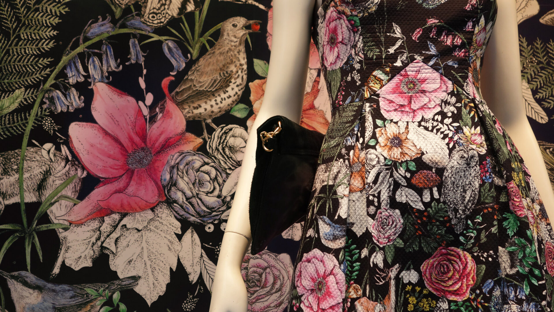
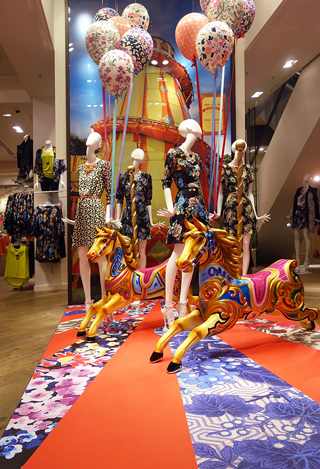
On other occasions, graphics definitely take centre stage, like these produced for Oasis. The fashion brand was very good at taking the look and feel of a collection and using the fabric patterns within as concepts for store graphics, often using them on the interior and exterior to great customer experience enhancing effect.
For all its troubles on the high street (and which retailer didn't have some difficulty over the past few years?) Oasis had a fantastic group of visual merchandising managers who were immersed in the brand and could successfully use each season's designs to articulate the collection visually throughout the stores with the help of captivating VM graphics.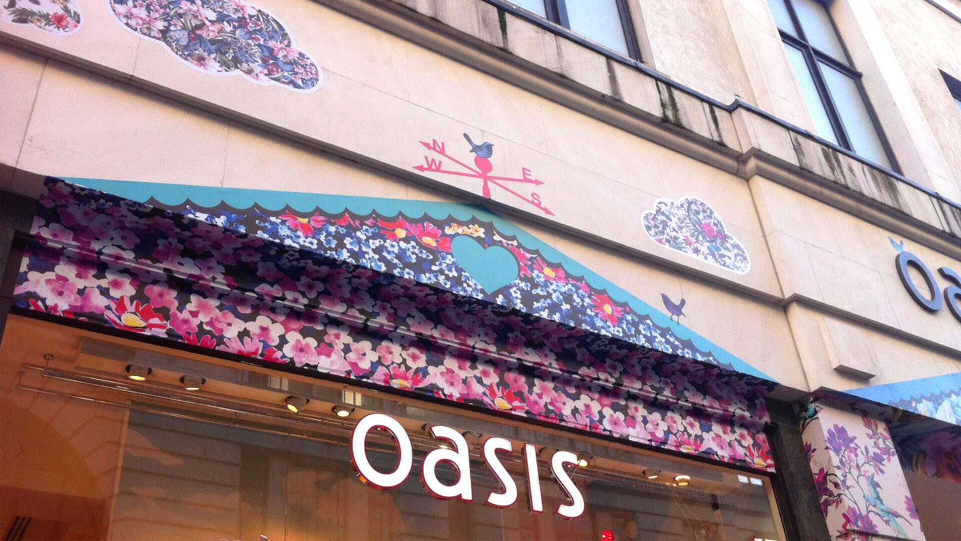
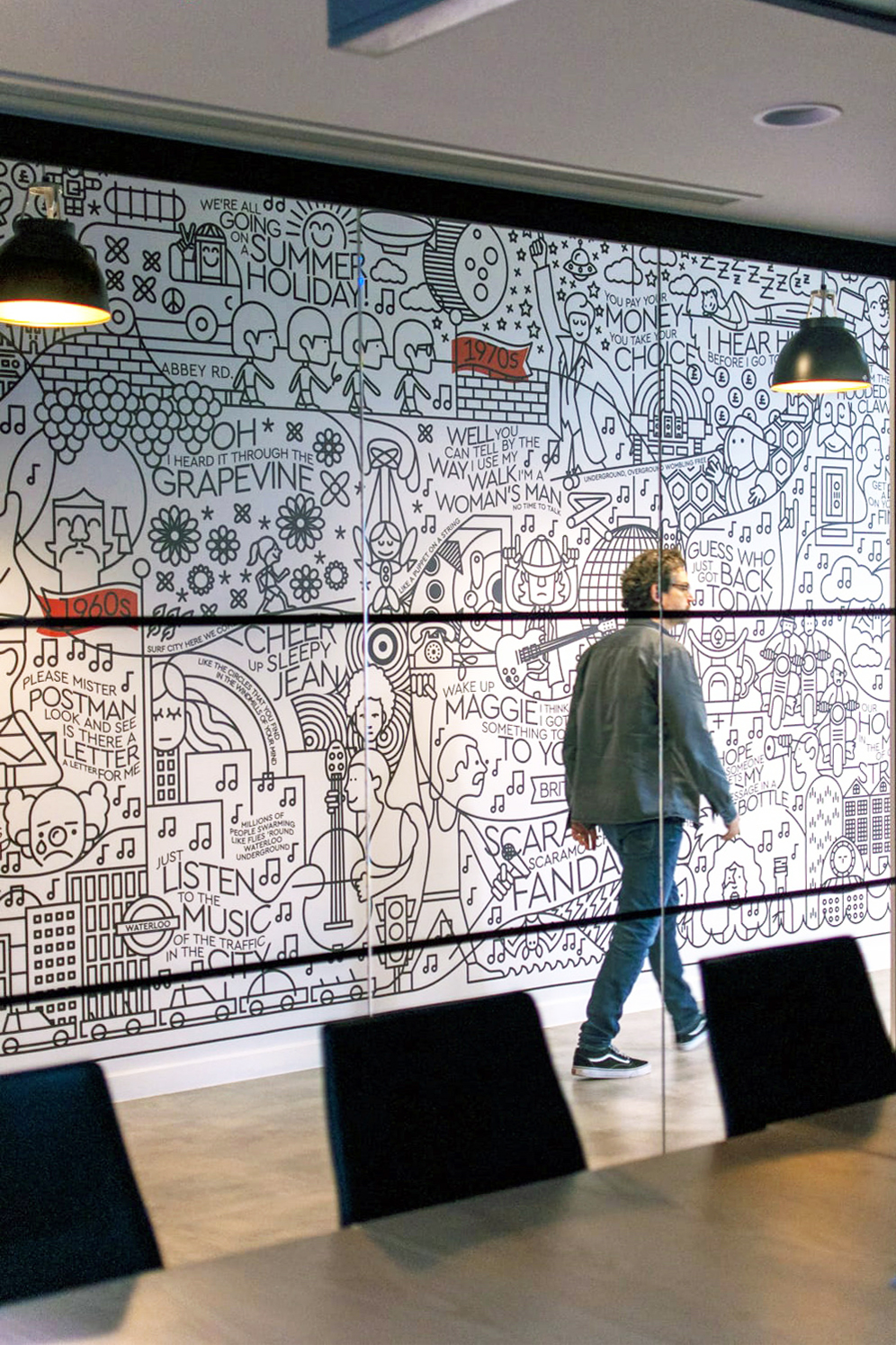
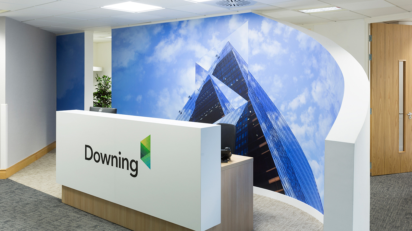
 Good use of graphics can enhance a brand by conveying its visual identity in places where it may otherwise have been limited, or previously not featured. A strong, thought-out and assured brand visual identity helps to share personality in all sectors, not just within the image-conscious retail world. The graphical medium is often used by companies within office environments also.
The use of graphics to engage and enliven an environment to customers, clients, suppliers and staff alike creates a space communicating the brand message and identity, perhaps with impactful imagery; clear succinct messaging portraying a tone of voice or even representational colour palettes which all help create a mood and sense of theatre within an environment.
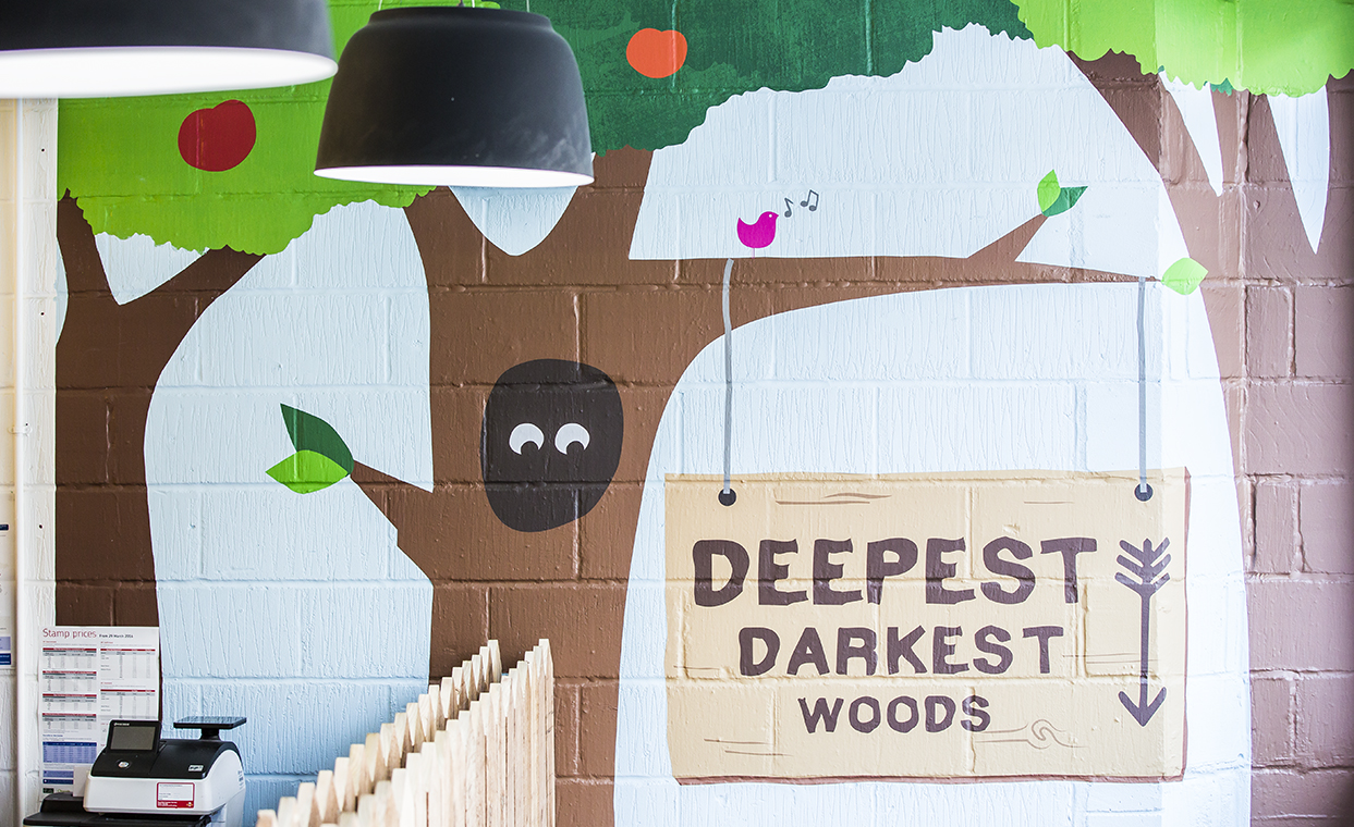
Remember, a graphic is a medium to share something visually – regardless of whether it is produced as wallpaper, a set of floor graphics, cut vinyl decals or another format for in-situ installation. Used well it can make an eye-catching impactful display or help create an inclusive, inspiring, atmosphere for your brand and those in its orbit.
Perhaps obviously, after years in the business, we are full of knowledge and the experience of how best to produce each graphic request. There is an abundance of substrates, papers, vinyl and alternate materials at our disposal, each unique in their own personality, to enhance your own.
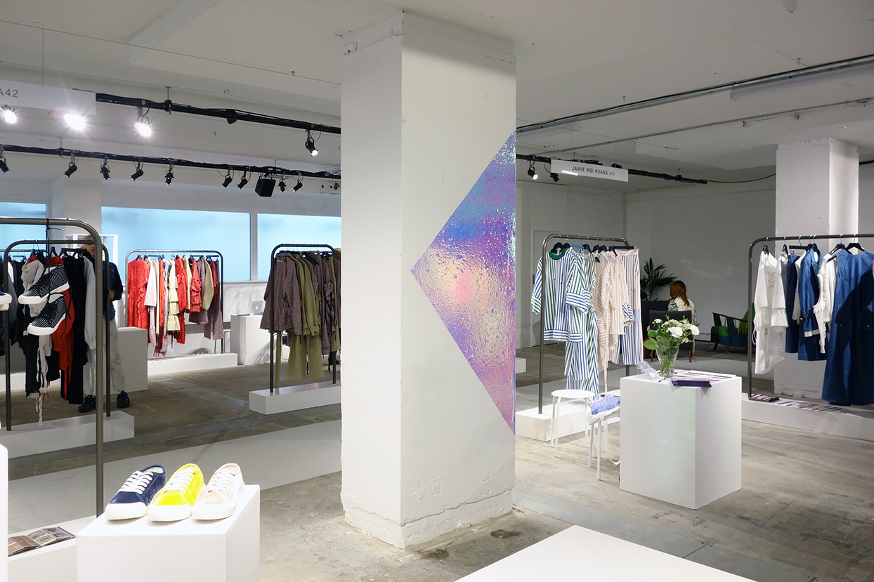
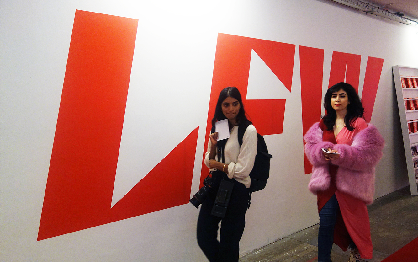
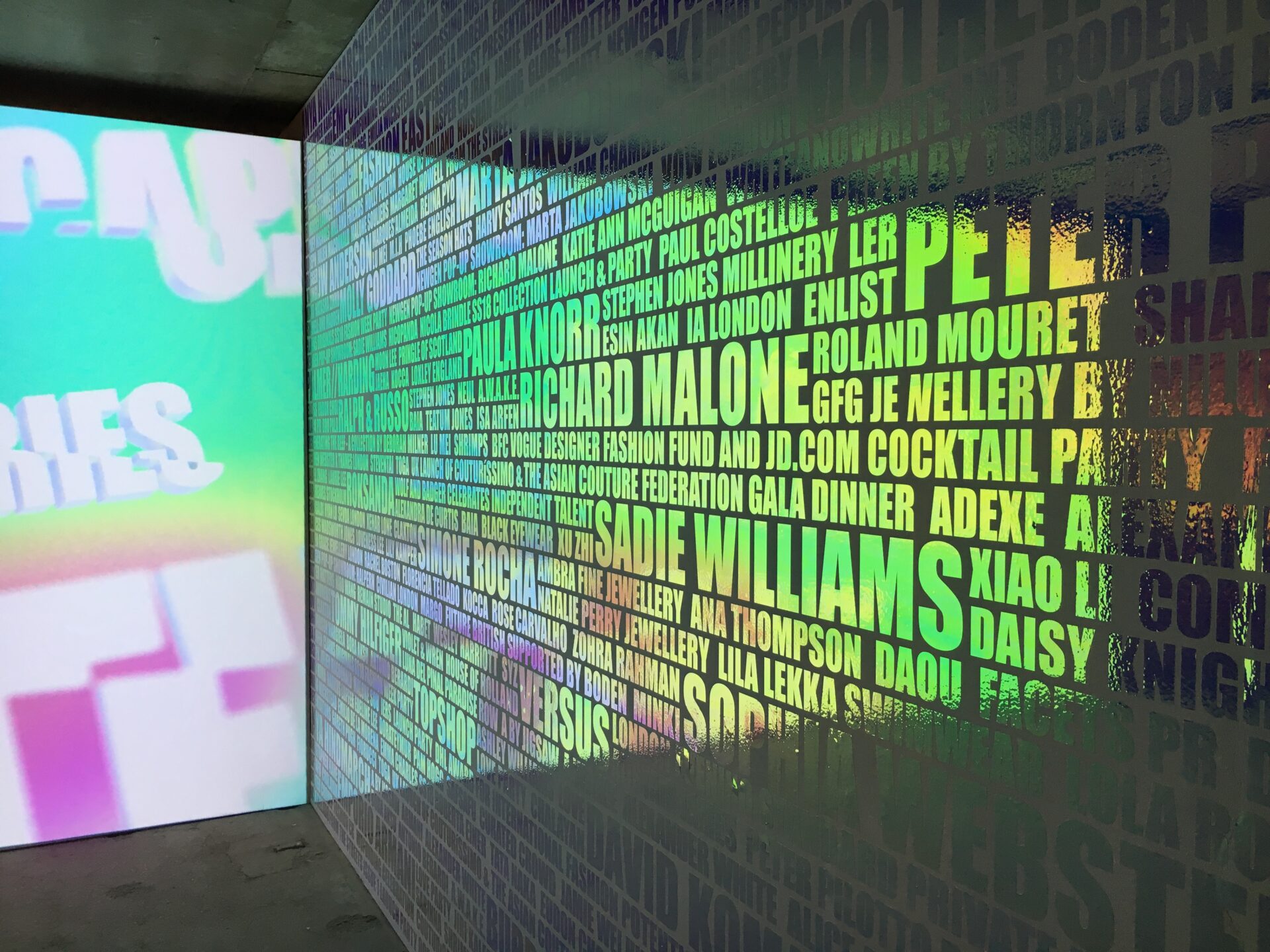
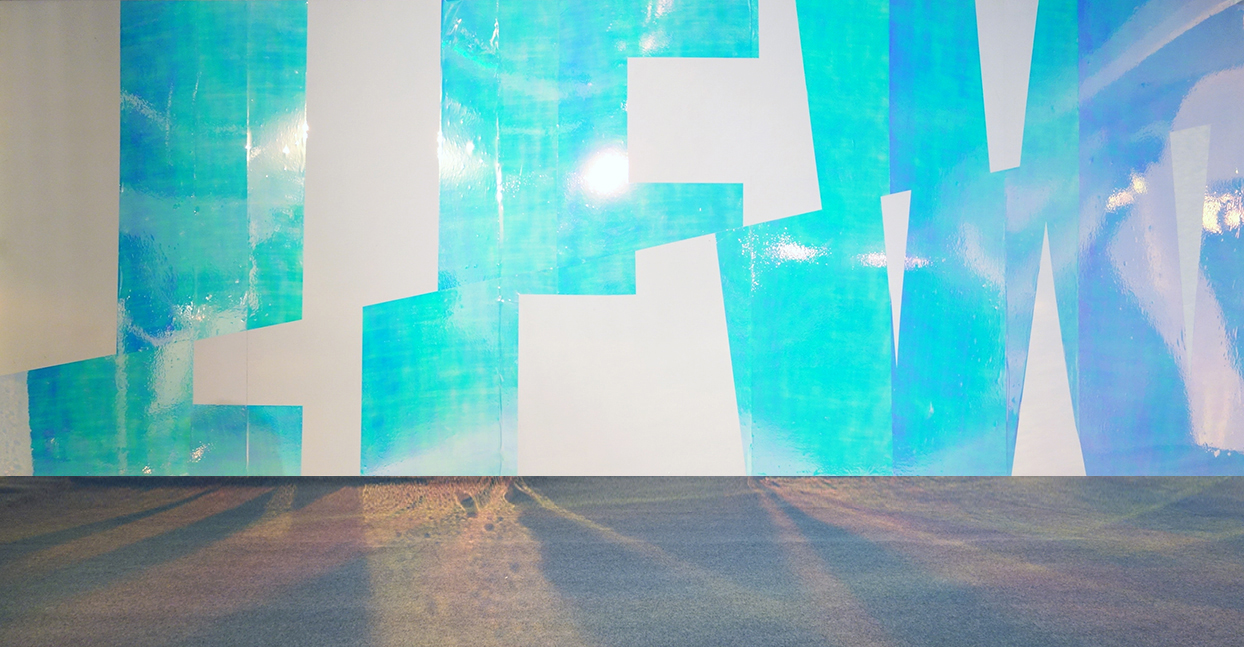
A really nice example of how material choice can enhance brand personality is in our work for London Fashion Week. The creative agency and event signage organiser Blonstien will always consult us prior to finalising the designs for the week-long events. After seeing initial concepts we would suggest certain substrates to enhance the look and feel of the creative, and fashion institution, further.
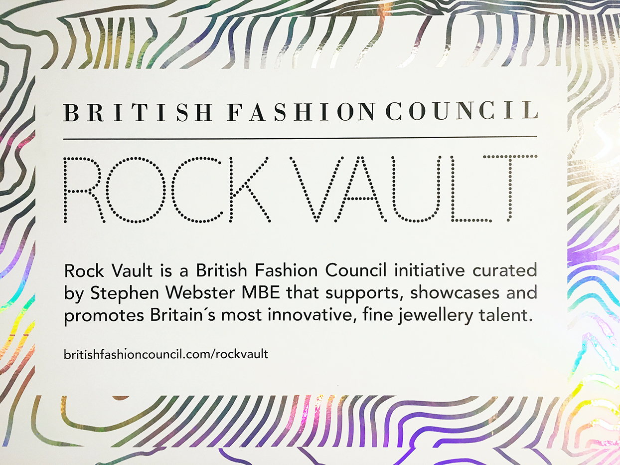
Over the years, some of the materials used include everything from standard, but bold coloured decal vinyl, and printable and cuttable dichroic types of vinyl (the with atmospheric sounding names no less) Nebula and Aurora – premium-grade non-PVC films used to create shimmering, decorative colour shifting effects when viewed from different directions. We chose Nebula for translucent film applied to glass and Aurora for the wall graphics.
We're well aware of the impact LFW has on the world stage. It's a global platform for designers, both established and those showing for the first time. We feel we have an obligation to the industry to make sure the event and the designers stand out and are seen as widely as possible. If our choices can help, so much the better.
If you would like further information we have a few useful help guides to read and spark ideas from, you can find them here –
Digital wallpaper
Printing to brick or concrete
Vinyl printing
As well as a portfolio of great graphic projects to inspire you too.
If you have a project coming up, retail, office-based, or other, drop us a message at print@thegraphicaltree.com or give us a call on 020 7580 4405 to discuss.
