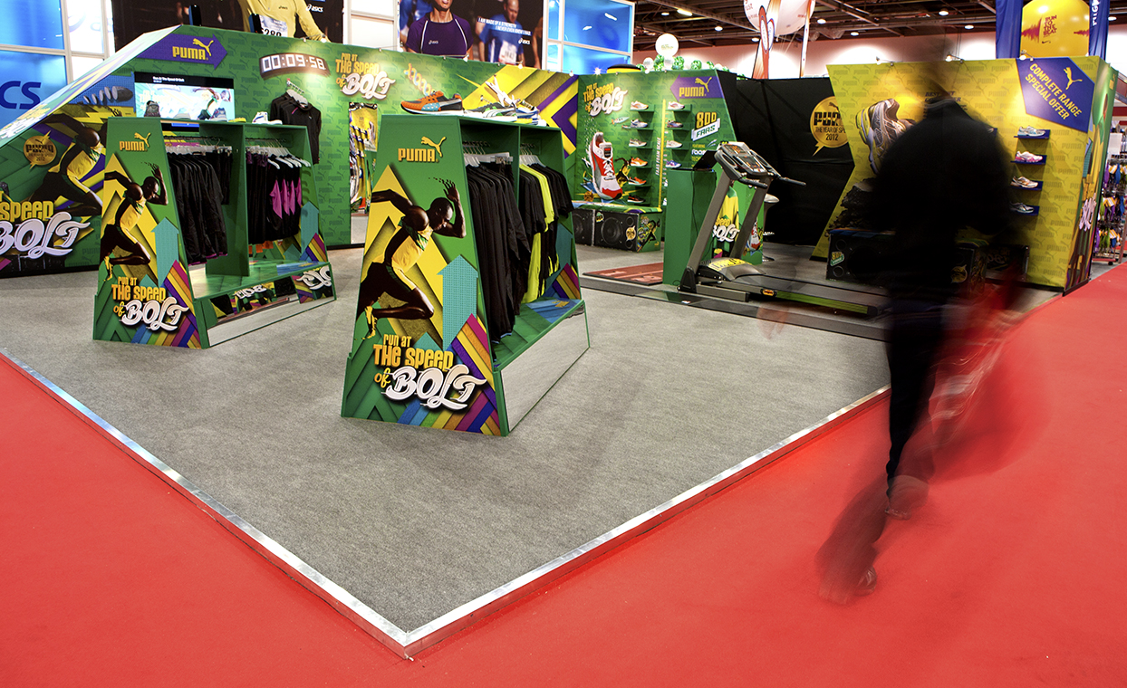
Explore our essential exhibition tips for planning your next event. The exhibition signage, exhibition stand design and graphics that you display and take with you are no doubt going to be responsible for this all-important initial first impression. To ensure that you've gained the interest of potential clients, and not just driven them into the arms of the ever-present competition, here are some exhibition tips to get the most out of your exhibition stand design.
Consider your audience
Contemplate who you're trying to appeal to; the demographic makeup of the exhibition's attendees should be seen as of equal importance to the message you're trying to convey with the design of your exhibition stand. Indeed, the message that the design of your exhibition stand is pushing should be moulded to best appeal to those likely to be viewing it. A more youthful or creative audience requires a more vibrant, exciting design; while stone-cold professionals require a more to the point, constructive layout. If possible, look at other examples of exhibition signage and stands from previous years, as they may provide key pieces of inspiration.
Pictures tend to communicate more
The statement “a picture speaks a thousand words†is becoming a tired cliché, but its meaning still has a profound impact on creating the ideal exhibition stand graphics. Your business' logo should be a prominent element in the design; while any text you do use should be supplemented and enhanced by liberal use of eye-catching and (importantly!) relevant imagery. The relevancy and eye-catching don't have to be mutually exclusive ideas; distil the concepts that make your business offerings unique and industry-leading, and discover/create imagery that best connotes this idea.
Utilise Interactive elements
Sometimes, especially when your competition has made a particularly good showing themselves, it's difficult to attract the attention of attendees based solely on the strength of the initial design. A superbly designed exhibition stand gets you in the game, so to speak, but doesn't win it for you. That's why you also utilise interactive elements; whether it's a slick video presentation, entertaining game, or informative handout, it can act as the final element that brings an attendee over to your stand or allows your staff to break the ice.
Keep the message simple
Don't spread yourself too thinly, pick one key business offering to feature prominently on your exhibition stand. If you try and say too much your message may be overly diluted or confused, and this will just get you and your exhibition stand ignored. Use your stand to promote a key feature that will bring attendees to you for further discussion; once they're on the hook, you can elaborate on the additional business offerings that collaboration with you would make available to them.
Make yourself easy to find
Of course, all of your hard work is for nothing if the consumers that you've converted to your business are unable to find you! The design of your exhibition stand should make it abundantly clear how you can be contacted, in case your onsite reps forget to mention, or if the attendee in question is unable to engage with them at the time. In this way, you can also funnel interested parties into the medium of communication that benefits you most, whether this social media, phone or email. Make sure your details are front and centre! Discover our exhibition stand print services, we work with prestigious clients interested in great design, in and around London.
